THE BEVERLY BTS
Craig recently sold this post war California style ranch in what we have been calling Culver City adjacent, also known as Castle Heights. We helped get this home into selling shape with a skinny makeover. AND WHEN I SAY SKINNY, I mean that budget was TIGHT.
I'll run you through some before and after's to give you an idea of what we mean when we say "Skinny Makeover". Sometime we mean literally paint and staging. Sometimes the paint is indoor & outdoor with a quick floor refinish and then sometimes we mean a bathroom and kitchen update too. Sometimes "skinny" means the whole enchilada, which isn't so skinny. But SO WORTH IT.
And a disclaimer.... because the #1 email I get asks if we can do someone's remodel for them... We are not contractors. We have a strong eye and know what we are looking at and looking for, but the seller actually hires the help and pays for the remodel, we just direct and design. And we really only do THIS for Craig's selling clients on a case by case basis and then of course we do it for our own projects.
THE EXTERIOR UPDATE:
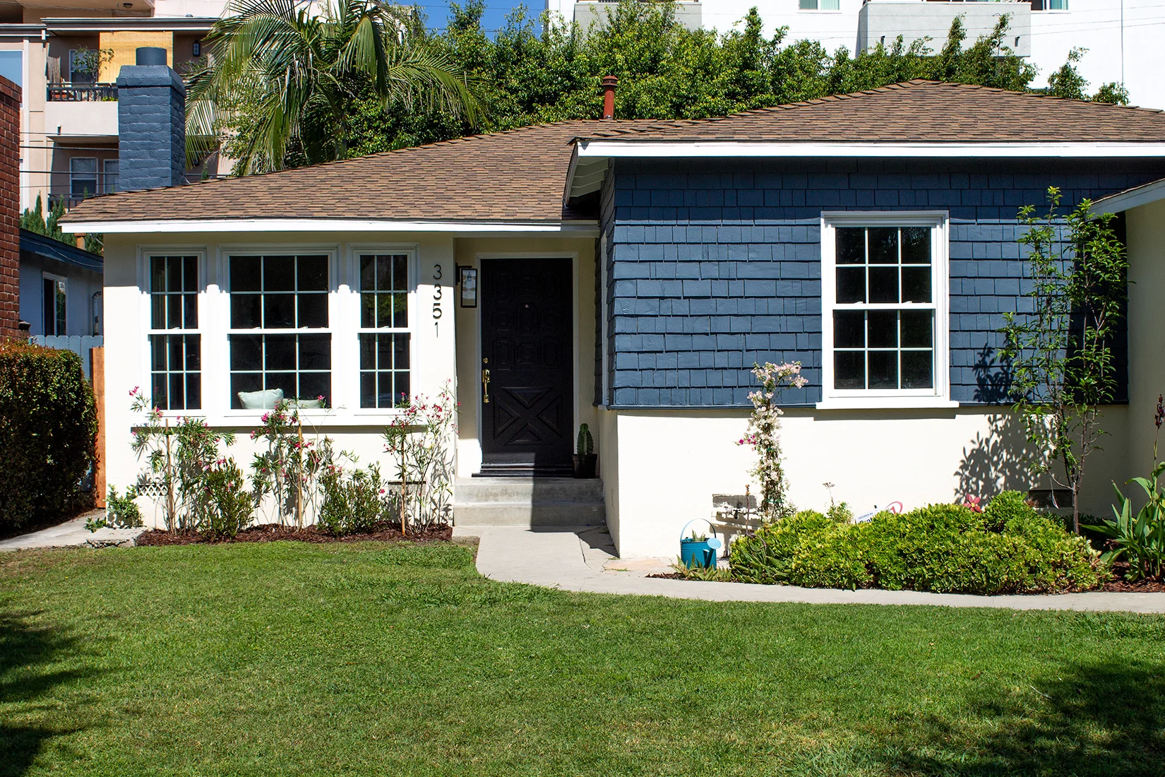
So it's cute-ish, but not commanding. She definitely won't jump off a page. There was a very small budget and is was pretty freshly painted... (yes these colors were recently chosen) so we needed a simple change that would make a big impact.
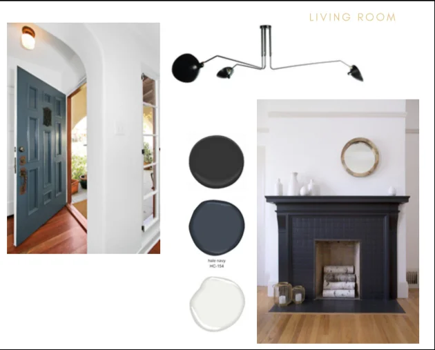
THE INSPO:
CLASSIC & MODERN
The Pop we needed was a deep Navy, something bright but not too bluey. I like a navy that is dark, bright and not too red. I don't want it to ever read purplish. Sometimes a yellower navy works, more on mid century homes. In this case we needed to test about 6-8 navys to find just the right one.
We needed a grounding element as well, and black often works well for that. The plan was to repaint the exterior contrast, changing the tan to navy, and then repaint the front door black. Pop in additional black accents in the form of a new exterior light, house numbers and then add a few plants. Our plant budget was $100.00 which is laughable. I think the plants we chose probably came out of pocket because we just couldn't bear the idea of doing nothing.
LOVING the navy. This wood shake is looking sharp. We also repainted the fireplace because brick should look strong and the faded ivory brick didn't do anything for me. This was repainted in just two days. DONE.
THE INTERIOR UPDATE:
I'll start with the "Before". Craig usually does his walk through, talks through issues buyers might have with certain rooms, macro and micro. In this photo I see a few things. The fan. REMOVE. People don't like fans (I hate them) and this house has HVAC so no need. The baby blue paint I would say has gotta go. Window coverings need to COME DOWN. The cat pea smell is a problem (renters lived here and didn't quite care for it the way you or I would.) That meant we needed to repaint the walls and sand the top layer off the wood flooring and then re-stain. The house needed these things anyway, so it's a win win. AND although the fireplace wasn't murdering anyone the way it was... it sure could be made BETTER, So that went on my short list of things we really SHOULD do.
And on the other side of the room was this nice built in. It did have GORGEOUS Antique drop pulls, which we could keep. My first choice was to knock this wall down because there is a huge kitchen on the other side, but the budget did not allow for this so I had to make it work.
Another room, another fan. This dining room had potential. The lower horizontal shiplap was in nice shape and allowed us to do something interesting with paint. The plan here was paint and floors and a light, and to LET THE LIGHT SHINE IN and remove the dingy window coverings. First things first.
THE INSPO:
BRIGHT WITH BOLD CONTRAST
Paint was the most transformative element in these rooms. I used Behr Gallery White on the walls. I wanted to run a grounding black thread throughout the rooms and pop in shades of blue throughout. Black was used on the front door, on the mantle and fireplace. It was connective to the rattan light fixture in the dining room. Those gorgeous vintage drawer pulls had a black teardrop shape.
My belief about design is that it should always be emotional. You need to walk into this house and fall in love. I find that if I LOVE something, than others will too. This color combo on the fireplace I LOVED. The navy was used on the brick facade and black was applied to the mantle. We ended up also painting the inside of the firebox black and the floor tile as well. It was definitely transformed.
WE ALL MAKE MISTAKES
So this light fixture didn't exactly seem quite so tall on the page and to my defense, most offer adjustability, so I was surprised by the fact that this light, which was the focal point to the room, was as large and tall as it was. Yes, I have a reputation for not completely reading specifications. I am trying to be better. Fransisco is only 5 feet tall. OOPS. This living room statement light will not work. Craig texted me this picture with a question mark???? Yeah, oops. We learned this 2 days before staging. PANIC. Thank god for 2 day shipping.
I also must sing the praises of good staging. Interior designers and stylists who help transform spaces and show them in their best light is the icing on the cake. Finding a good staging company is one of the most important part of selling the house. To my surprise I know people who refuse to stage their homes when they sell, and in both cases, the house didn't sell.
You are selling lifestyle, you are selling a life STYLE to someone. It helps to show them what that looks like in an aspirational and stylish manner. I am 100% aware that the amazing staging done by The Platform Experiment here takes this skinny remodel to the next level. I mean, come on.... that chair, it kills me. Without amazing staging this would just be a newly refinished beautifully painted bright room with an AMAZING fireplace. Great but not finished.
And sometimes I take the liberty to make a few tweaks post stage. I added the above rug to the room. I love this beautiful copper color rug, it comes from my own living room, bought from Mesa Vintage Rugs off instagram, it is my favorite.
And who doesn't love a perfectly stacked stack of books with a side of Frida?
And there was this runner on this table. Dream combo.
This house sold quickly and with multiple offers above asking. That is the point, that and making homes better versions of themselves. Craig's seller was SUPER HAPPY. I'll show you the kitchen and bath soon. Stay tuned.


